
235,715
Delivered orders

Searching someone who can help with assignment help online? Hire our best assignment experts and enjoy the best grade.
isuals are the new heroes in storytelling; with their attractive and informative images and quotes, it is much
rogramming assignments are the tasks and projects which are assigned to the students. These assignments focus on the
V
isuals are the new heroes in storytelling
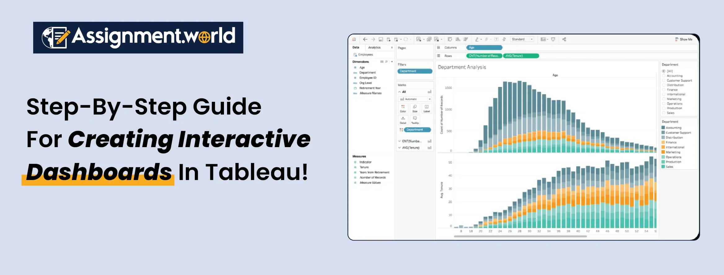
easier to understand anything now. There are many tools in the market now that do the job, but among all of them, all eyes are now mainly on Tableau. Dashboards in Tableau are engaging, creative and easy to understand for anyone.
with their attractive and informative images and quotes, it is much easier to understand anything now. There are many tools in the market now that do the job, but among all of them, all eyes are now mainly on Tableau. Dashboards in Tableau are engaging, creative and easy to understand for anyone.
Are you someone who doesn't really know about Tableau dashboard design? Or maybe a beginner who wants to learn it all? Then you are at the right place. With these blogs, you can know everything that can help you make a great dashboard for sure. So here is your step-by-step tutorial with additional tips.

A Tableau software dashboard is a collection of multiple visualisations like charts, graphs or maps that are displayed in a single screen. With Tableau, you can have a quick view of data insights and make informed decisions.
When you create a Tableau dashboard, you can combine multiple worksheets to form an interactive and dynamic visual story. This is not just about visuals but about how data communicates meaning to its audience.
Dashboards can allow users to filter or click through data or use static for presentation. The best Tableau dashboards bring together clear design, precision and interactivity.
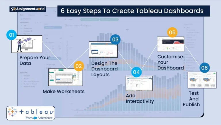
We present you with some easy and viewer-friendly steps for building dashboards in Tableau.
Step 1: Prepare Your Data
Before you dive into the visuals, first, you need to clean and structure the data. Tableau software dashboard connects seamlessly with a variety of data sources like Excel, SQL databases, Google Sheets and cloud-based data platforms.
The key steps you need to follow in data presentation are:
First, open Tableau and click on the option to connect to data and then select your source.
Now, checking for any missing values, duplicates, or inconsistencies can assist you in fixing structural issues automatically.
When you are using multiple databases, use the join and blend features to combine related data fields effectively.
Lastly, derive the new insights by adding computed values like profit margins, ratios or growth percentages.
When you properly prepare your data, the dashboards in Tableau perform smoothly and accurately while presenting your insights.
Step 2: Create Worksheets
Each of the Tableau software dashboards starts with a single worksheet. Worksheets are where you can build the components of visuals, like charts and maps, before combining them.
These are some suggested visuals for beginners:
Bar charts for comparing categorical data.
Line charts for visualising trends over time.
Pie charts for showing propositions.
Maps for geographical data presentations.
Tree maps and scatter plots for advanced and multidimensional analysis.
Feel free to experiment with different charts to see which one you can use to convey your story, as Tableau is quick in switching between visuals and intuitive.
Step 3: Designing The Dashboard Layout
After you have created your worksheet, it is now time for you to design your Tableau dashboard design layout. A good design can make sure that your dashboard is functional and visually appealing to your audience.
Keep it simple, only include the visual that serves a purpose.
Tableau allows you to arrange items using containers for better alignment.
Use a consistent colour scheme to highlight the key inside.
Place the most critical KPIs at the top or centre of the dashboard.
Maintain balance with white space for readability and aesthetic appeal.
A well-planned Tableau dashboard design can enhance usability and help you navigate through your dashboard intuitively.
Step 4: Adding Interactivity
One of the strongest features of Tableau is interactivity. Interactive elements can turn a started dashboard into a dynamic one that can make it a more engaging experience.
Popular interactive features are:
With filters, you can focus on particular segments like a region or a time period.
Highlight action lets you click on one visual element to highlight related data points as well.
You can use URL actions as well for directing users to external web pages or reports.
With parameter control, you can add sliders or drop-downs to let users adjust the data inputs.
When you combine all these features, you can create a Tableau dashboard as an experience that can support exploration and people’s understanding of your dataset.
Step 5: Personalising Your Tableau Dashboard
Personalisation can transform your dashboard from a functional to an exceptional one. Use the formatting options to find the team for your visual elements.
Follow these personalisation tips:
Adjust the forms and borders for clarity.
Include a title and annotation to provide a context.
You can personalise your dashboard according to your organisation's branding with images and logos.
You can also create different layouts for desktop, tablet and mobile.
Personalisation makes your dashboard visually appealing to users and more user-friendly, which is an important factor when you are dealing with stakeholders.
Step 6: Testing And Publishing The Dashboard
Remember that before you share your work, test every feature on your own. Make sure that the filter actions and links are working properly. Reviewing your dashboard's performance on the last data basis can slow down responsiveness.
When you are ready to publish the dashboard:
For student and personal use, publish it in Tableau Public.
For secure or organisation-wide access, publish it in Tableau Server or Tableau Cloud.
This final step allows you to interact with others through your visuals and drive inside in real time. You can further look up Tableau dashboard examples online for a better understanding of how it presents ideas clearly.
Different types of dashboards are going to serve different purposes depending on your goals. Hence, understanding the types of Tableau dashboards is going to help you select the right one for you.
Use a strategic dashboard to track overall business performance and KPI s.
Follow analytical dashboards for discovering data deeply and finding trends or correlations.
Apply operational dashboards to monitor real-time processes and daily metrics.
Practical dashboards can help you to support mid-level management decisions and short film analysis.
When you know the purpose of all the types of Tableau dashboards, it can help you to structure your data and design efficiently.
If you are a beginner, then studying Tableau dashboard examples can be an excellent way for you to learn about designing principles. Here are some of the inspiring examples from the community:
The Sales Performance Dashboard: It is the combination of KPI regional maths and friend lines to display business development.
Marketing Analytics Dashboard: This is to portray campaign performance, engagement rates and ROI.
Healthcare Analytics Dashboard: It is used to visualise patient outcomes and hospital resource utilisation.
Finance Dashboard: This one is beneficial for checking revenue, expenditure, and profitability through interactive charts.
Following these best Tableau dashboards can help you understand how design data and interactivity can create powerful business insights.
It is important to know what mistakes you need to avoid while you are learning to create a Tableau dashboard.
No need to overcrowd the dashboard; keeping too many things can create confusion, so try to write clearly.
Do not ignore data accuracy; always validate data before you visualise it.
Poor colour choices can destroy your presentation; ignore overly bright or inconsistent colours.
A lack of interaction is not acceptable; add filters and highlights to make the dashboard more engaging.
Not testing for responsiveness is a huge mistake. Make sure the dashboards look good on all devices.
When you avoid these mistakes, then your dashboard can become more functional and professional and user-friendly and stand as one of the best Tableau dashboards.
Building a dashboard in Tableau is an exciting process that blends creativity, technical skills and analytical thinking. Hence, following the step-by-step approach, you can get to prepare data, customise it and publish as you want. By looking at the Tableau dashboard examples, you can design your dashboard as you want so that it can tell a compelling visual story.
If it is your first time, then obviously you can have a problem making your dashboard. But if you want, we can help you with our services to make a dashboard just how you want. Assignment World offers you Tableau assignment help of high quality that can visualise the ideas you want to present.