
235,715
Delivered orders

Searching someone who can help with assignment help online? Hire our best assignment experts and enjoy the best grade.
hy are your management assignments not creating an impact despite quality information and analysis?
rogramming assignments are the tasks and projects which are assigned to the students. These assignments focus on the
W
hy are your management
Sometimes, the problem can be with the presentation of data and statistics in management assignments. Yes. The risk of "analysis paralysis" is caused when you cram information and data, but fail to communicate through proper presentation. This can be particularly challenging when dealing with large data volumes or not understanding which tool suits you best.
assignments not creating an impact despite quality information and analysis? Sometimes, the problem can be with the presentation of data and statistics in management assignments. Yes. The risk of "analysis paralysis" is caused when you cram information and data, but fail to communicate through proper presentation. This can be particularly challenging when dealing with large data volumes or not understanding which tool suits you best.
Here, you can get answers to all your queries, as we have curated some practical tips for appealing data and statistics presentations in management assignments. However, professional management assignment experts like ours at Assignment World can also do that for you, having delivered quality writing and presentation help for millions of students.

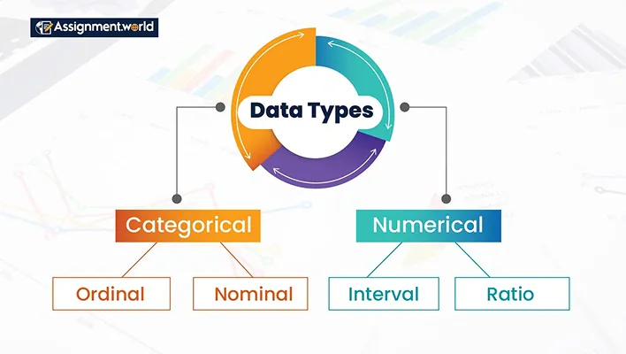
You typically have to deal with two types of data structures in management assignments. One is quantitative and the other is qualitative, apart from statistical data.
Quantitative Data: Quantitative data in management assignments are generally numerical information that is analysed and measured using statistics. These can be conversion rate figures, number of employees, sales revenue numbers, etc.
Qualitative Data: Qualitative data are non-numerical and can be binary, ordinal, or nominal. These are strictly descriptive information that defines the qualities, observable traits, and characteristics. Examples can be observation transcripts and customer feedback.
In management assignments, one of the pertinent challenges is not just data collection but also presenting such data and statistics in assignments. To help you overcome these challenges, we have given some easy yet practical tips on how to organise and visualise data in any management assignment topic. From following proper structure to labelling, you get a holistic insight into quality data presentation here:
Follow A Clear Structure
You cannot abruptly introduce the data and statistics in management analysis. There must be a logical structure where your data fits in perfectly.
First, clearly state what you aim to demonstrate and present the data findings accordingly to add relevance. To make it more impactful, describe how you collected the data, explaining the statistical methods used in the process from collection to analysis. You can even use bar charts for data comparison, line graphs to demonstrate trends and patterns over a time period, and tables to record numerical data.
Break Down Complex Data
Sometimes, the data collected in the process may not be simple to understand for professors. To ensure your analysis does not go in vain, you can break down the complex data.
You can use methods like dispersion or central tendency to transform such complex data into understandable formats. Scatter plots and heatmaps are good examples. While scatter plots demonstrate the relationship of data variables, heatmaps make data presentation more colourful. Depending on the data, you can use textual, tabular, and diagrammatic methods for better presentation.
Use Visualisation Tools
The Visualisation technique is a key consideration when presenting data and statistics in management assignments. Your visualisation technique determines the narrative that you want to convey whether you want to show the data pattern changes over time or the relationship between variables.
Apart from the standard chart types, like Gantt charts, line charts, bar charts and scatter plots, you can use advanced visualisation software too. Popular tools are:
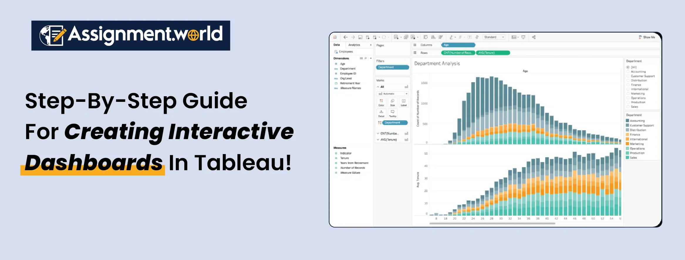
Tableau: Tableau is a popular name in the data visualisation domain that can connect with diverse data sources and offer data visualisation support within a user-friendly interface. It is popular for data blending, dynamic dashboards, trend and spatial analysis.
Power BI: As a business intelligence visualisation tool, Power BI supports data-driven decision making, offering multiple visualisation types like maps and charts. With high accessibility, quality interactive features and integration support, it is a top tool for strategic data visualisation.
Looker: Looker is another top visualisation tool from Google known for its shareable dashboards and reports, creating interactive visuals for data presentation. It has advanced data storytelling features with seamless integration support, making it a top favourite for management students.
Maintain Data Accuracy
All your data presentation means nothing if the data itself is faulty. Data accuracy, thus, is highly significant in management assignments. To maintain proper data accuracy, you must implement the data validation rules and check whether the data is valid and updated.
First, you need to prioritise quality data sources to obtain credible data. Next is how you perform the data cleansing by correcting and identifying the inconsistencies and errors for accurate outputs.
Monitoring data quality, from using software for accuracy checks, and data integrity using policies can help maintain data accuracy.
Use Standard Formatting
Just like the structure of data presentation, the format of data and statistics presentation also matters. Various management assignments have different formatting conventions, and you must obey them. This can be about the fonts and colour, where you must use consistent and standardised fonts throughout the assignment.
It is also about the layout, alignment of the text, and graphics used to maintain proper readability and engagement. Creating a master slide can ensure uniformity in the visual elements for effective data and statistics presentation in management assignments.
Always Label Your Data
Labelling ensures accuracy and professionalism, helping to differentiate various data types and preventing misinterpretation. You can use informative titles for the graphs and charts. Also, check that all the units and axes are correctly utilised. You can use legends for easier identification while presenting diverse data series and categories. Brief notes and callouts also go well in data presentation, explaining the rationale behind the classifications, etc. This can also help to demonstrate the key insights and data trends clearly.
Data presentation is, therefore, crucial to management assignments. Translating complex data into an understandable form. Management students, thus, must comply with proper data presentation rules to enhance the overall impact and presentation of the assignments. However, there can be pertinent challenges of ensuring data accuracy and selecting the appropriate visualisation tool and techniques. You can surely get helpful insight through the above-mentioned tips to present data and statistics in management assignments. However, you can also reach out to management assignment help experts who can help with writing, presentation, formatting, and proofreading within time. Assignment World can be your best choice for management and statistics assignment services. Connect with our experts today and ace your dream grades this session.